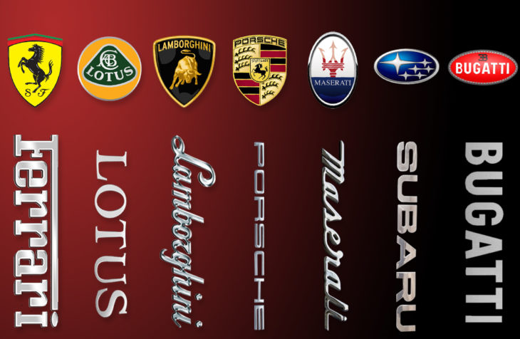
Do you ever wonder how our iconic marques got their logos? Long before brand management and marketing agencies were around to custom design a ‘winning’ emblem, some of our best loved racing car badges took inspiration from their founder families, their home country and even the universe.
If you’re the proud owner of one of these supercars (for everyone else, there’s always supercar driving experiences – like these at Into the Blue), remind yourself of these 7 stories proudly displayed on the bonnets of racing cars all over the world. If you want to establish your brand or business, it starts with a logo. With that in mind, it would be a huge game-changer to hire companies such as logo design florida.
- Ferrari
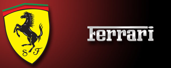
The famous prancing horse has its roots in Italian military history, long before it became associated with Ferrari. In World War I, Italian aviator Count Francesco Baracca had adorned his warplanes with a cavallino rampante for luck and to symbolise his squadron, the Cavalry Regiment. He died before the end of the war and when Enzo Ferrari met the war hero’s parents in 1923, it was suggested that he might use the same logo on his race cars, both as a sign of good luck and by way of a tribute.
When Ferrari founded the Scuderia Ferrari racing team in 1929, he kept the horse emblem (slightly redesigning the tail to point upward) and added a bright yellow background, the official colour of Ferrari’s home town of Modena.
- Lotus
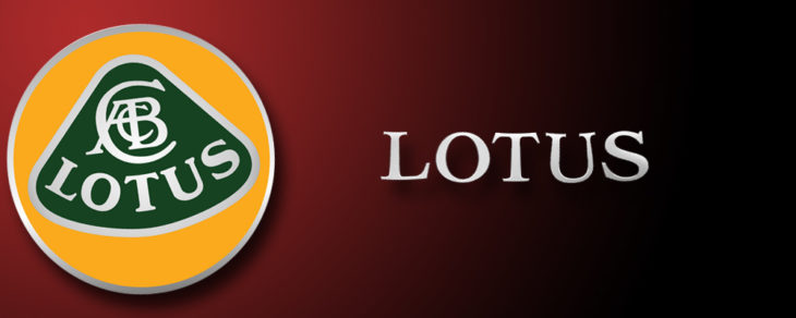
The British racing car maker Lotus Cars features the initials of the company’s designer, builder and founder, Anthony Colin Bruce Chapman, intricately interwoven, on its logo. In fact, the initials are more prominent than the name of the marque, leading many to conclude that it accurately reflected the personal connection between the brand and its founder.
Why Chapman called his car a Lotus remains open to speculation; some say that because once you drive it you’ll forget all others. The choice of British Racing Green as the background colour for the lozenge is more obvious, while placing it on a field of yellow signifies the sunny days of success that Chapman hoped for his company.
- Lamborghini
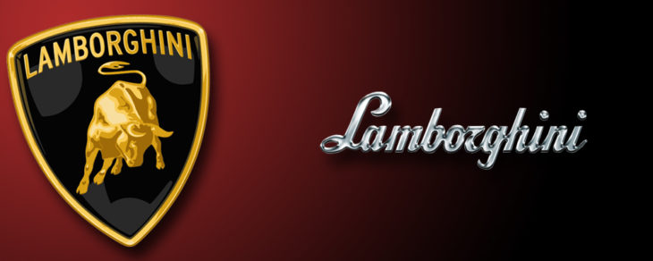
The golden snorting bull on a black background goes back to Ferruccio Lamborghini’s fascination with bullfighting. Did you realise that many of his cars are named after powerful bulls? The Miura takes its name from the Miura Cattle Ranch whose Spanish owner Don Eduardo Miura was a close friend of Ferruccio Lamborghini, while Islero, Diablo and Murcielago are all legendary fighting bulls.
The logo also represents the founder’s astrological sign: Taurus, the bull. The golden animal stands for wealth and excellence while the black background colour reflects power, prestige and elegance. And if you think the similarity to Ferrari’s emblem is coincidental, you’d be wrong – there was a long standing rivalry between the two car makers.
- Porsche
The intricate Porsche badge reflects its strong connection to its regional heritage; it’s a combination of elements from two coats of arms. The crest of the Free State of Württemberg in southwest Germany is overlaid with the coat of arms of the city of Stuttgart, the regions former capital, where Porsche cars were made.
And if you’re wondering about the horse – did Porsche steal it from Ferrari? – here’s a perfectly legitimate explanation. Stuttgart (the name is derived from the German Stutengarten meaning ‘stud farm’) was founded in 950AD by Duke Liudolf of Swabia who bred war horses; the city’s coat of arms has always featured a prancing horse!
- Maserati
Maserati was officially formed in 1914 by Alfieri Maserati, one of 7 brothers, all of whom were involved in automotive development and manufacturing except one. Mario Maserati, a talented artist, has instead been credited with the design of the iconic emblem, paying homage to the company’s birthplace of Bologna. The trident is the traditional symbol of the city where Maserati cars were originally built before the company’s relocation to Modena.
The Maserati logo is based on the world famous statue of the Roman God Neptune, situated in the fountain at Bologna’s Piazza Maggiore, with red and blue added as a further acknowledgement. It was first introduced in 1926 with the Tipo 26.
- Subaru
Subaru is a beautiful Japanese word meaning ‘united’. It’s also the name of the Pleiades star cluster M45 in the constellation Taurus, also known as The Seven Sisters. One of the ‘sisters’ is meant to be invisible, which is why the Subaru logo only features 6 stars.
The Japanese corporation Fuji Heavy Industries (FHI) interpreted the logo as a unification of the stars, alluding to the companies that merged in 1953 to form FHI, Subaru’s parent company. The corporation adopted the Subaru star cluster a its official logo for its line of cars.
- Bugatti
Ettore Bugatti approached his father for logo design inspiration. Carlo Bugatti, an influential jewellery designer and furniture manufacturer in Milan, designed an elegant oval badge as the perfect representation of technology and elegance, using the colours red, black and white to signify passion and power, excellence and splendour respectively.
Sixty red dots on a white border symbolise either pearls or safety wires, a nod to the company’s extremely high level of assembly requiring no gaskets. The logo is completed with the stylish EB trademark above the brand name to honour the company founder, Ettore Bugatti.

